Insight Studio Showcase
These examples use synthetic data to illustrate the setup.
Anonymised snapshots from our working demo—dashboards, scheduled alerts, and a workflow in action.
What it looks like
Anonymised snapshots from our working demo—dashboards, scheduled alerts, and a workflow in action.
Executive dashboard (Looker Studio)
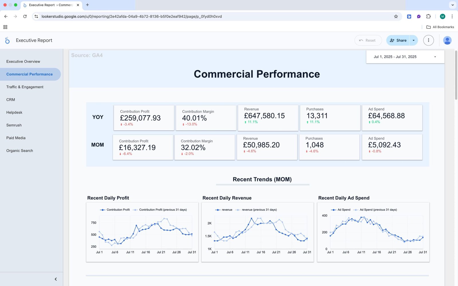
This is the everyday view for leadership and stand-ups. It puts the core numbers in one place so the team can check performance without digging through multiple tools.
What you see – Top-level KPIs — Revenue, MER, AOV, ROAS — with trends over time and a quick breakdown by channel. Filters for date range, channel/source, and market make it easy to answer follow-ups on the spot.
Why it helps: Everyone is looking at the same, up-to-date figures. It speeds up meetings, reduces “which number is right?” conversations, and makes it clear where to focus next.
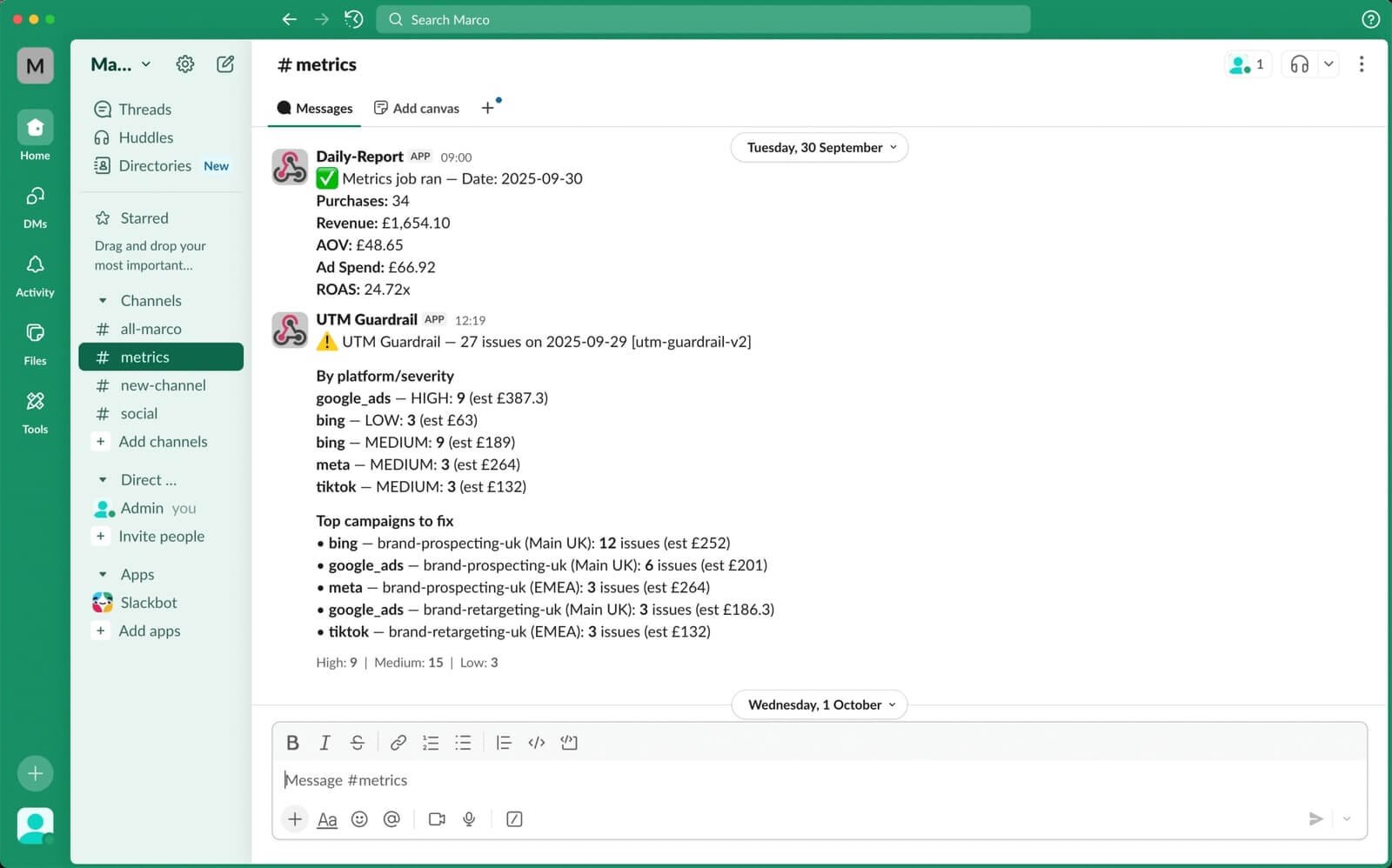
Anomaly alert (delivered to your tools)
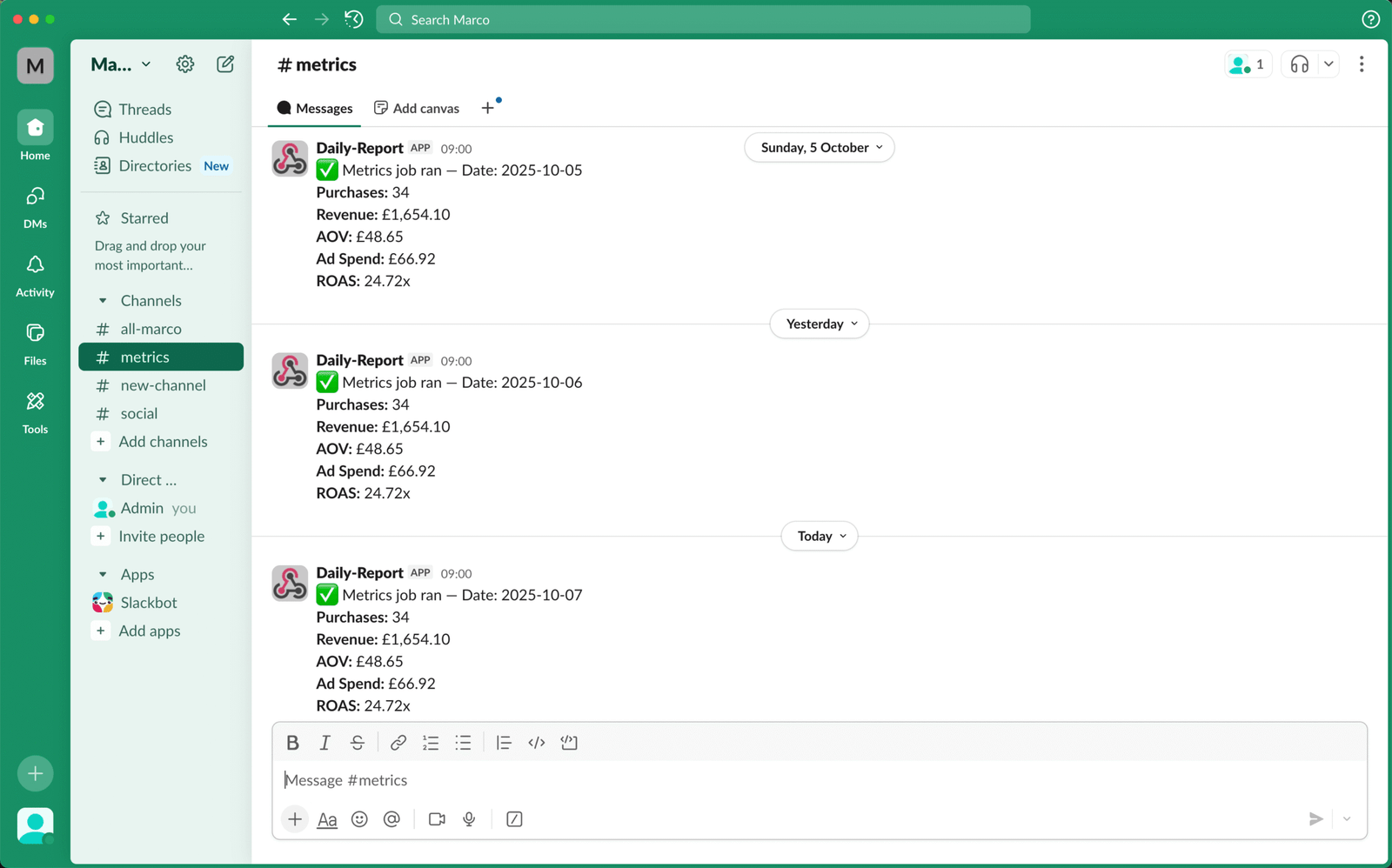
We track a small set of signals and notify the team on a schedule.
What you see: Checkout rate variance vs seven-day baseline with a deep link to the report.
Why it helps: You hear about changes early, in Slack/Teams/Email—not a week later.
Workflow — Weekly 404 → Redirect Map
New content and migrations create broken URLs and lost traffic.
What you see: Weekly sheet with new 404s and suggested destinations; summary posted to Slack/Email.
Why it helps: Fixes are queued and published quickly; traffic recovers earlier.
Method & Audit
Each alert and workflow writes to a simple log, so you can see what triggered, when, and what changed. Dashboards show the trend before and after—not just the activity.
- Baselines and comparisons (e.g., seven-day average)
- Time to acknowledge and time to resolve
- Before/after on the affected metric
Contact Us
If you have any questions, please contact us at hello@altomate.co.uk or by using the contact form below.