Insight Studio Showcase
The examples on this page use synthetic data built in BigQuery. Nothing here is from a real client account — it’s a working demo of how the setup looks in practice.
What it looks like
Anonymised snapshots from our working demo—dashboards, scheduled alerts, and a workflow in action.
Executive dashboard (Looker Studio)
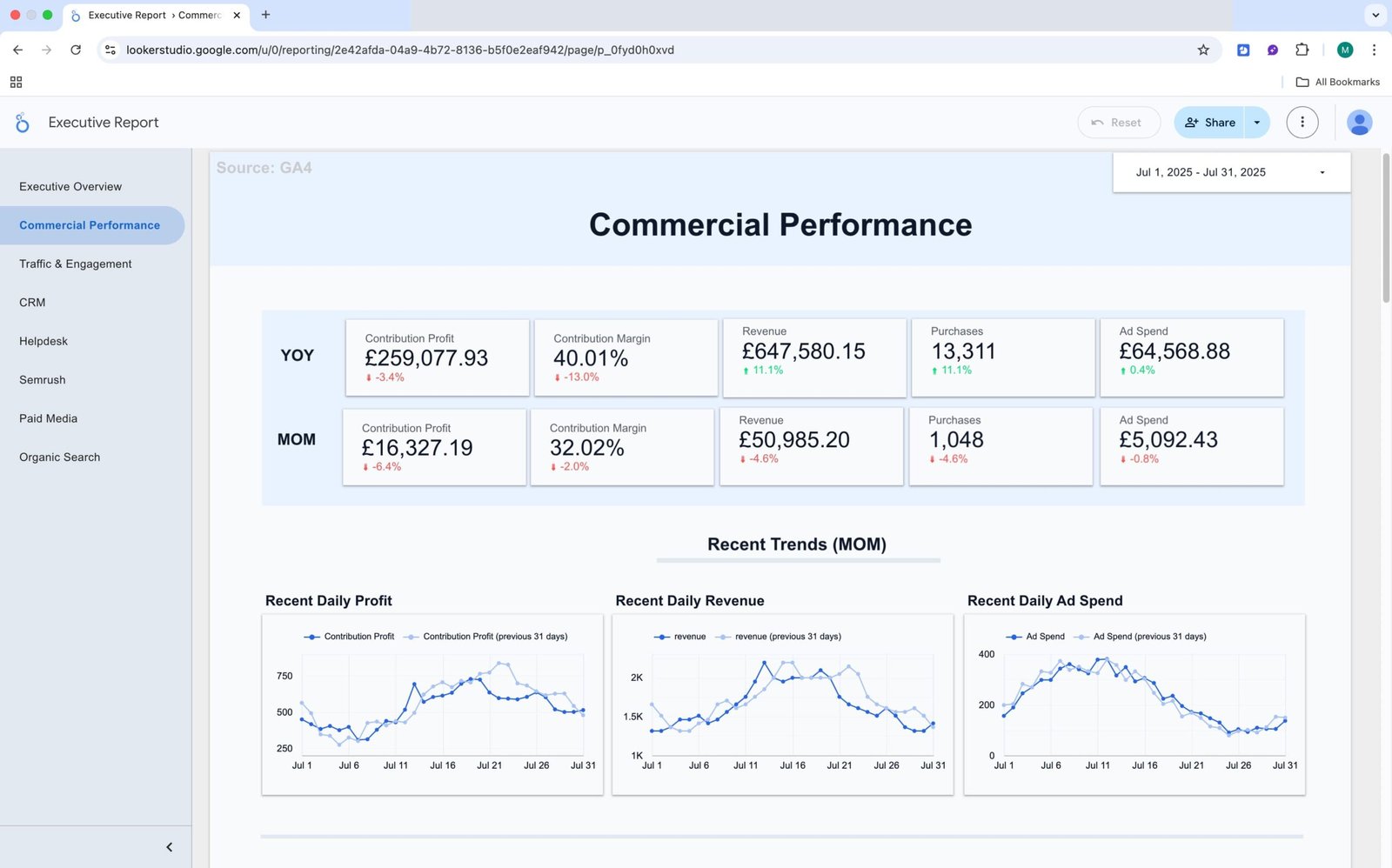
The everyday view for leadership and stand-ups. Core numbers in one place so the team can check performance without digging through separate tools.
What you see: Top-level KPIs — Revenue, MER, AOV, ROAS — with trends over time and a breakdown by channel. Filters for date range, channel or source, and market, so follow-up questions can be answered on the spot.
Why it helps: Everyone reviews the same up-to-date figures. Meetings run faster, and there are fewer “which number is right?” debates.
Anomaly alert (delivered to your tools)
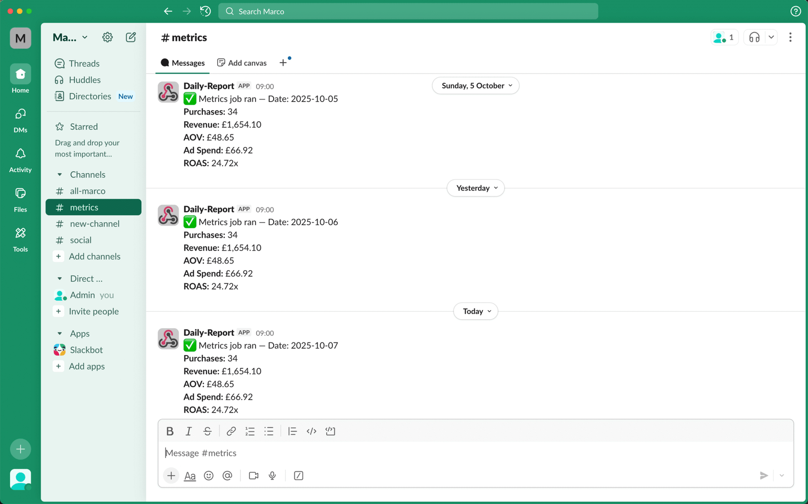
A small set of signals tracked and sent to the team on a schedule.
What you see: Checkout rate variance against a seven-day baseline, with a link straight to the relevant report.
Why it helps: Changes get picked up early, in Slack, Teams, or email — not a week later in a monthly review.
Workflow — Weekly 404 → Redirect Map
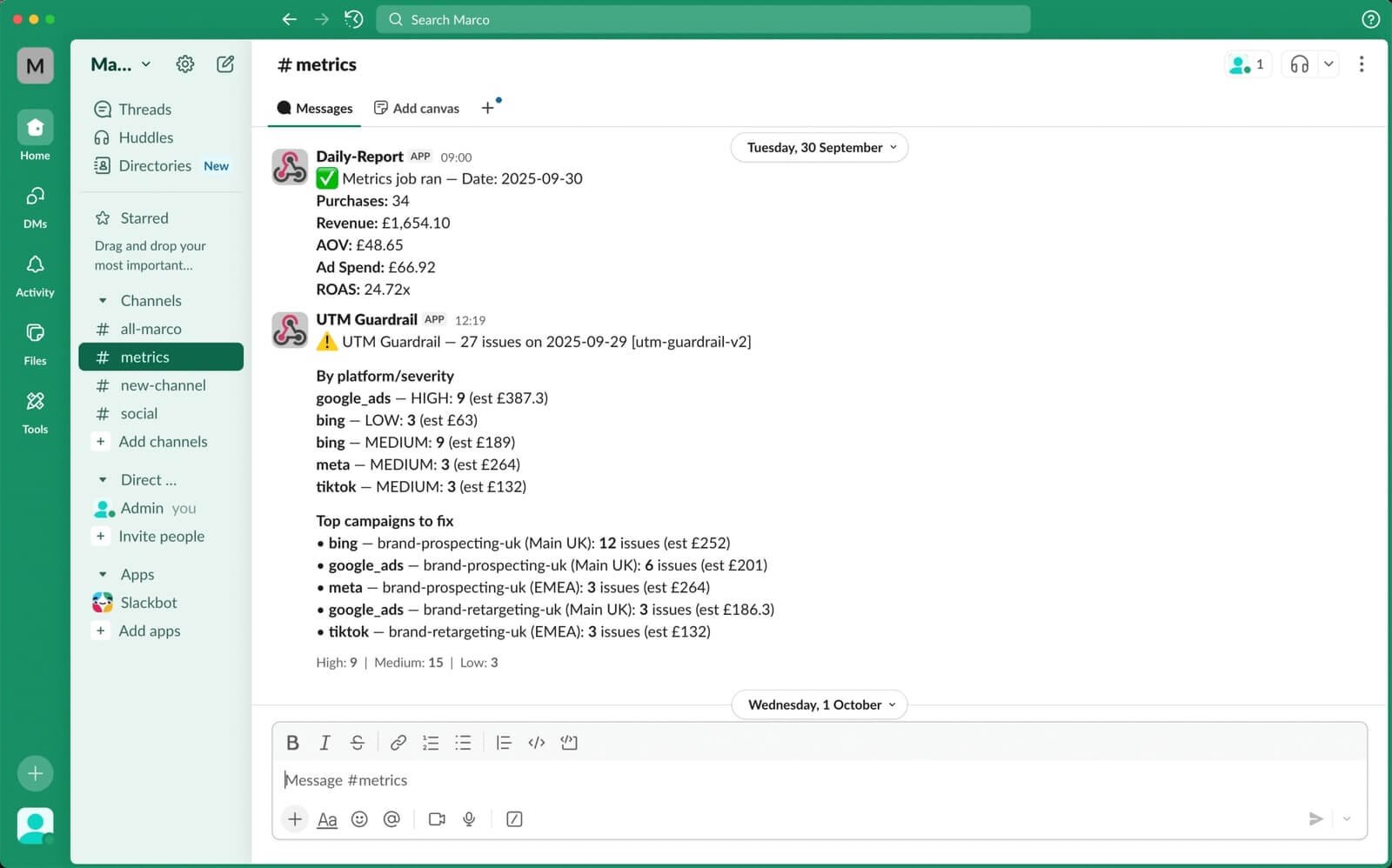
New content and site migrations create broken URLs and cost you traffic.
What you see: A weekly sheet listing new 404s with suggested redirect destinations, plus a summary posted to Slack or email.
Why it helps: Fixes get queued and published faster, so traffic recovers sooner.
Method & Audit
Every alert and workflow writes to a simple log, so you can see what triggered, when, and what changed. Dashboards show the trend before and after, not just the activity.
- Baselines and comparisons (for example, a seven-day average)
- Time to acknowledge and time to resolve
- Before and after on the affected metric
Dashboard Options
You can run everything inside one report or split it into separate dashboards by team. A single unified report works well when everyone reviews the same data. Alternatively, separate dashboards make more sense when departments need their own view and shouldn’t be scrolling past pages that aren’t relevant to them. The most common configurations are:
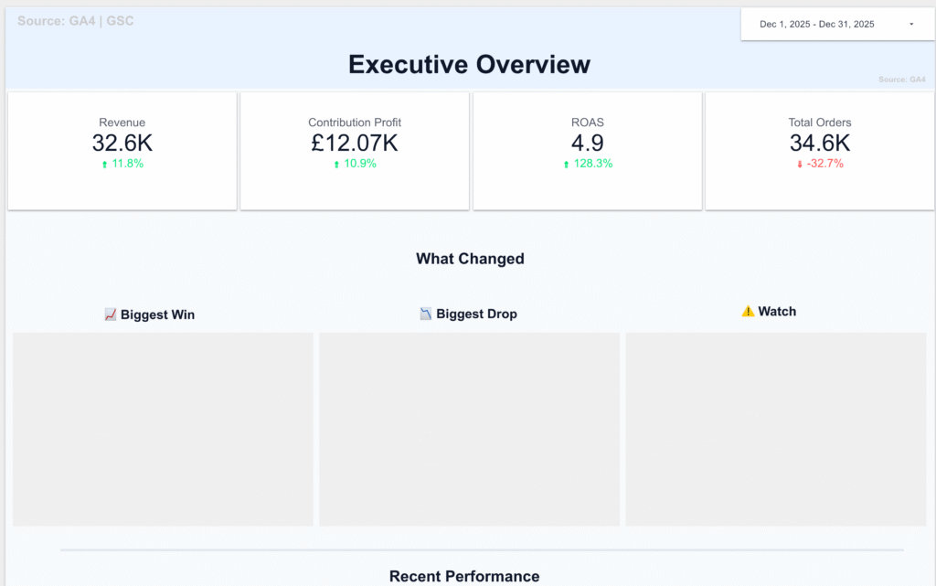
Executive Dashboard
A one or two-page snapshot covering the numbers leadership actually looks at: revenue, margin, top-line spend, and key ratios. Designed to be read in under two minutes.
Marketing & Performance Dashboard
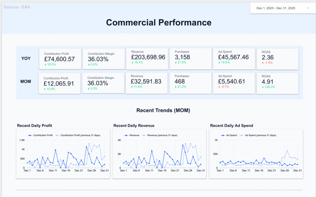
Covers commercial performance, traffic and engagement, paid media, and organic/SEO. Semrush data included if connected.
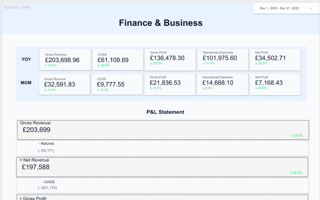
Finance & Business
P&L and budget vs actuals, sales pipeline, and product performance. Built for whoever owns the numbers.
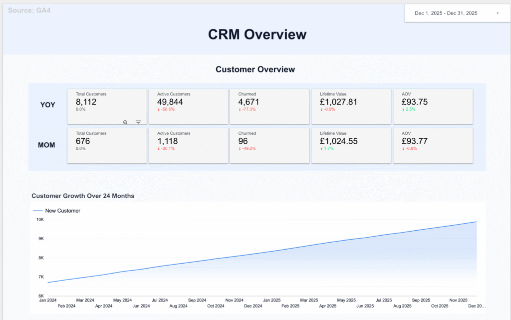
Customer Operations
CRM activity, helpdesk ticket volumes, and email marketing performance. Keeps customer-facing teams informed without manual reporting.
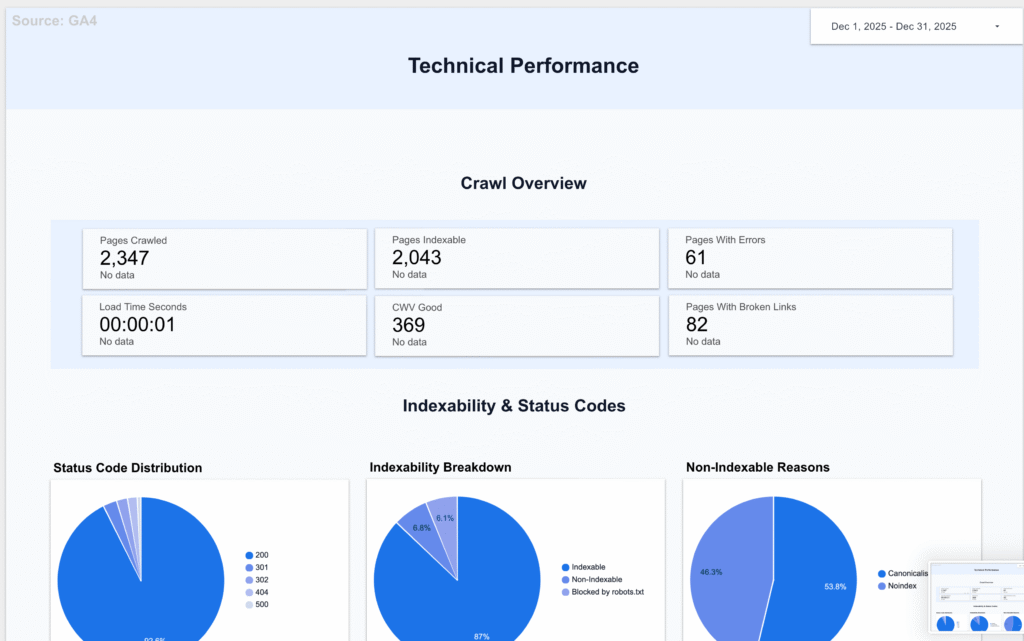
Technical Performance
ScreamingFrog crawl data and Core Web Vitals. Useful for dev and SEO teams tracking site health week to week.
Contact Us
If you have any questions, please contact us at hello@altomate.co.uk or by using the contact form below.